Case Study
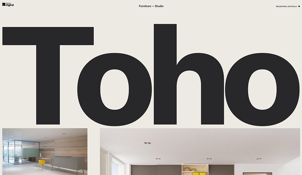
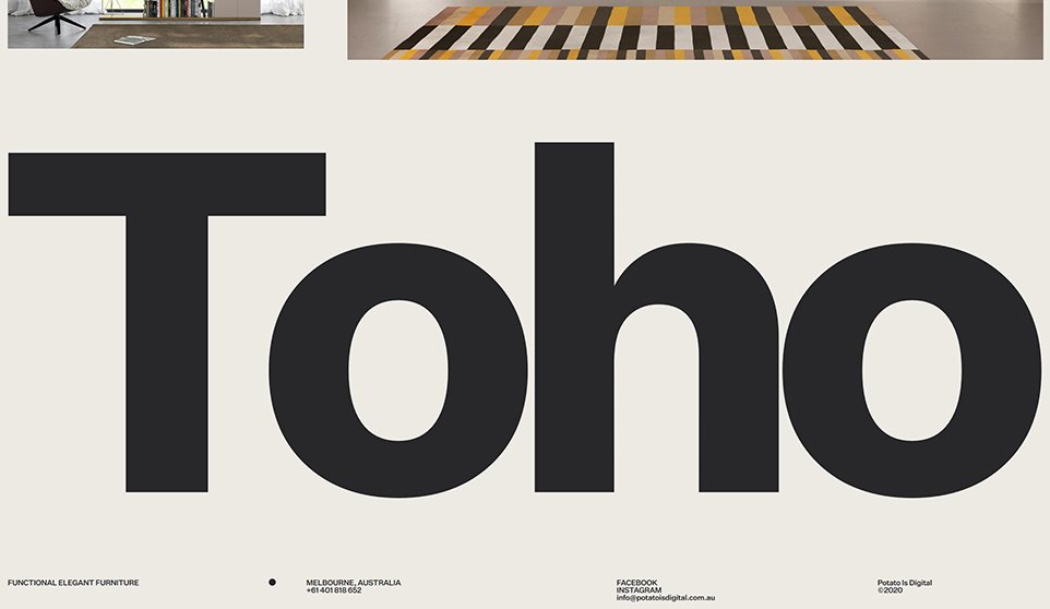
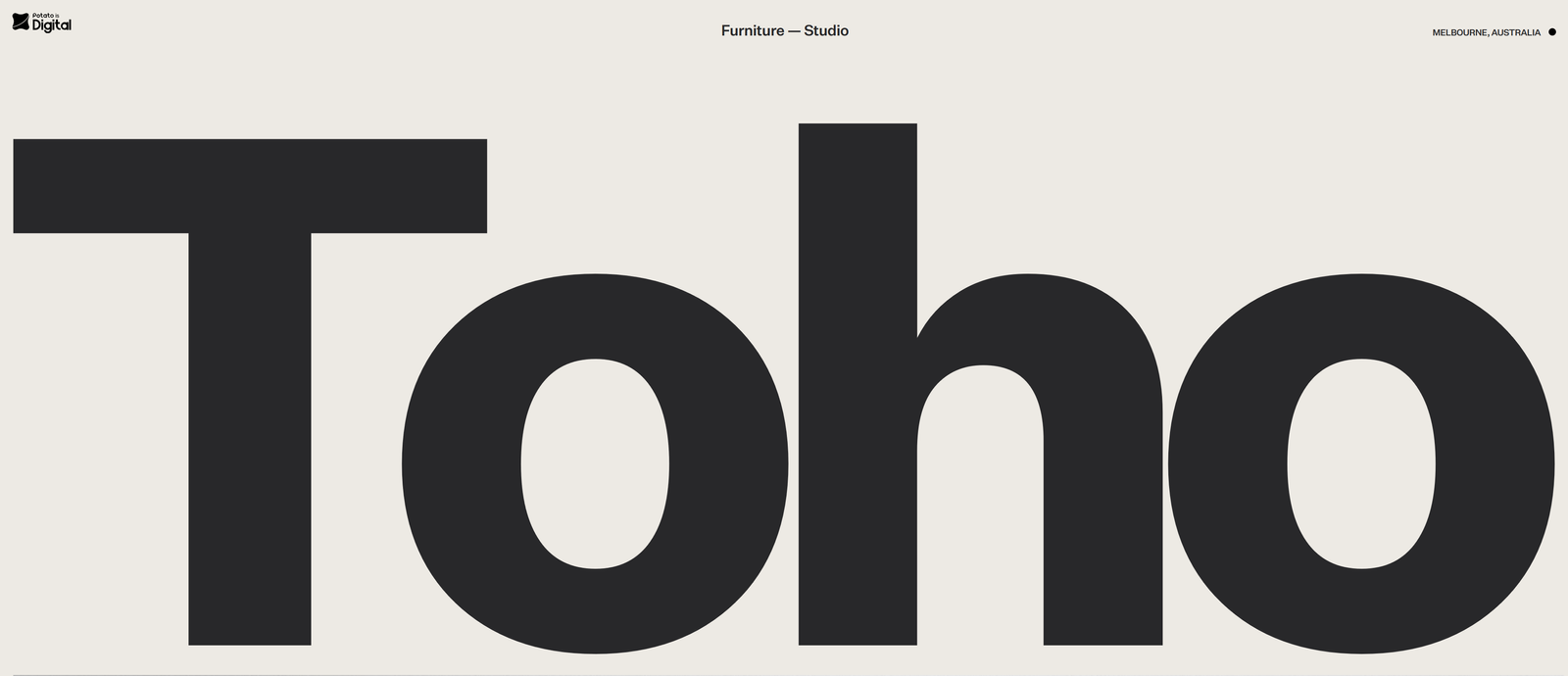
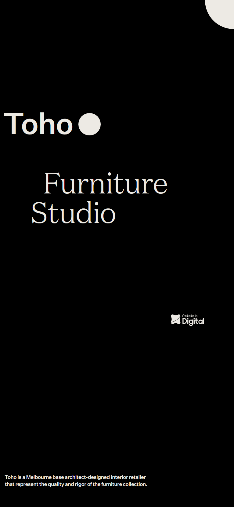
Toho
Digital services to help brand transform
Overview
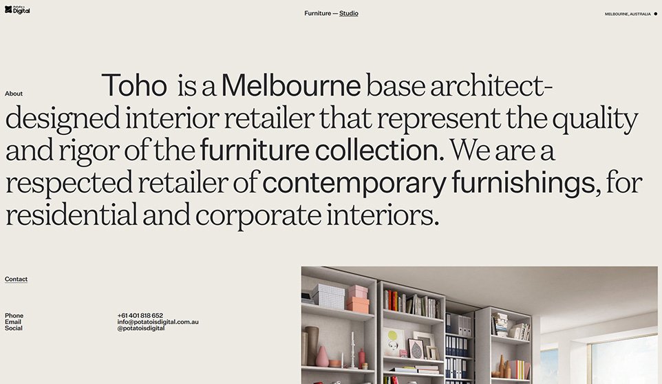
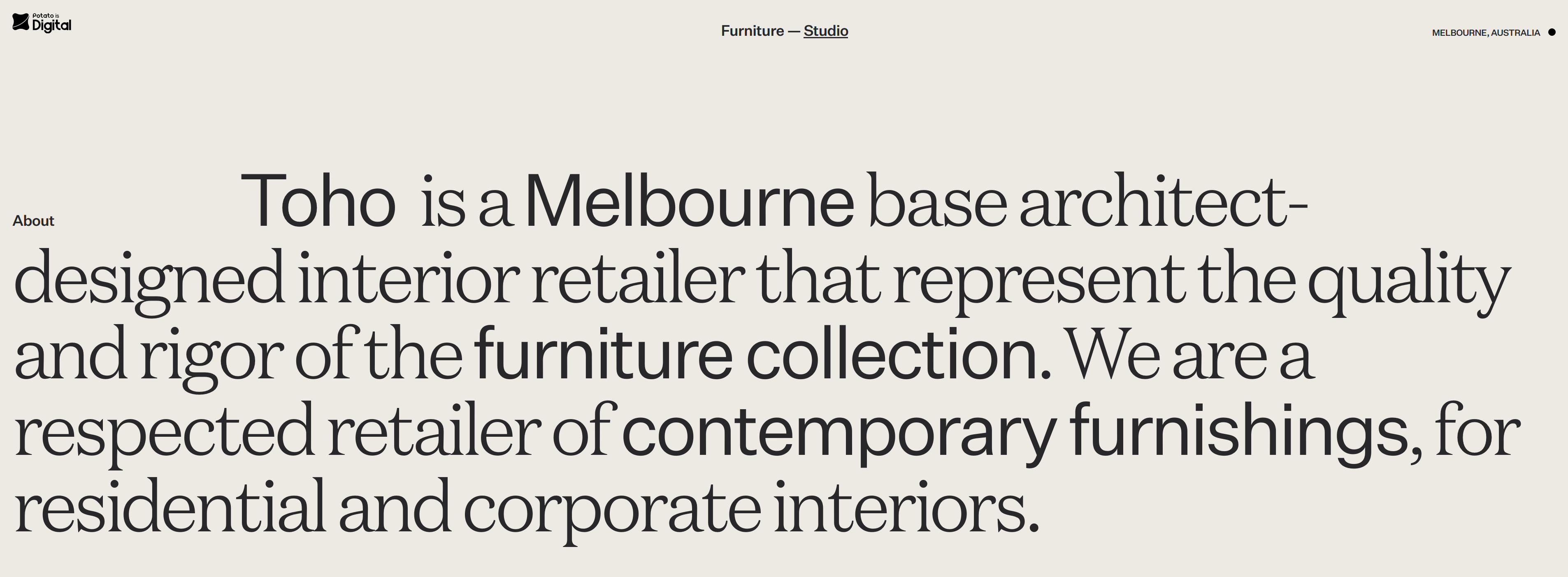
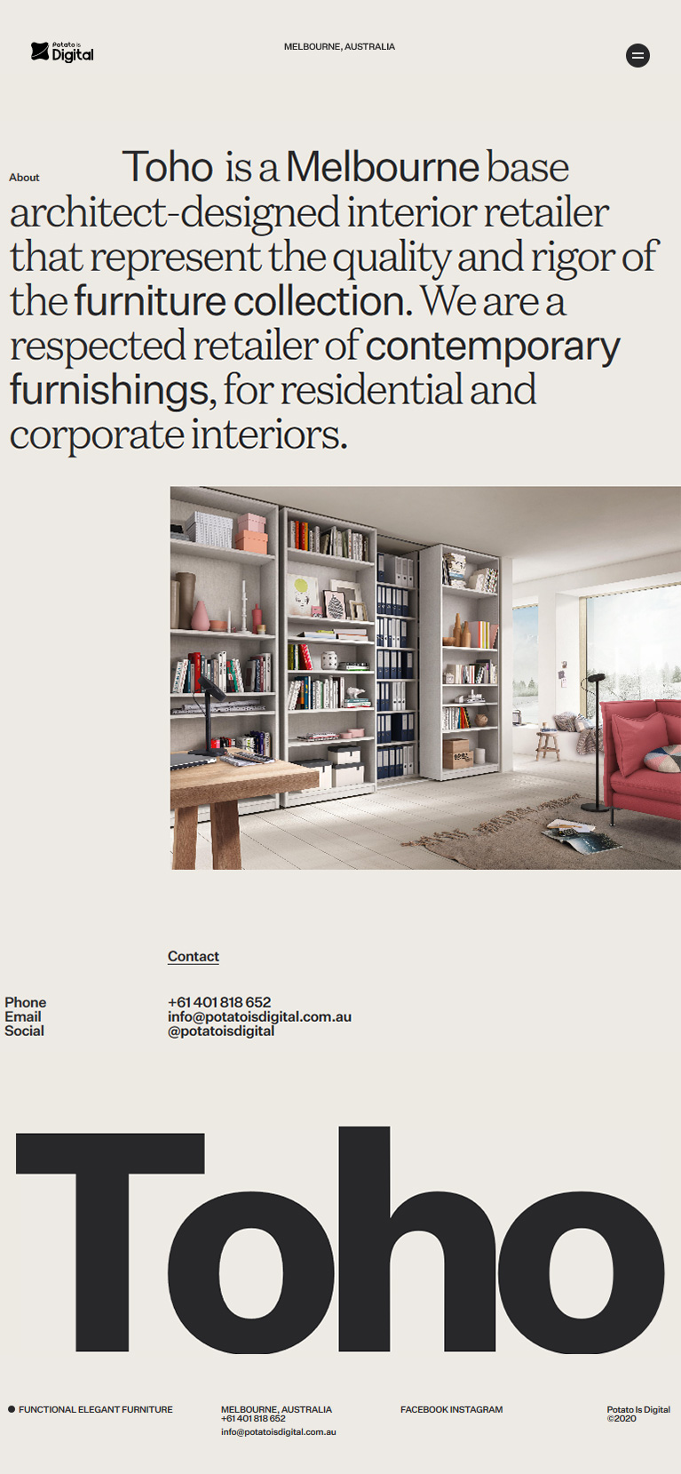
Toho is an adaptable visual platform for retail partners or channels that want to facilitate product discovery, product and brand education, and enriching the user journey.
What We Did
- Research and product strategy
- Digital experience strategy
- Website design and prototyping
- Digital branding, animations, and motion
- Art direction, product photography, digital branding
- Responsive web development
“Our experience design efforts were focused on portraying the brand aspect through a new minimalist design language, friendly and approachable content: connecting user interests to amazing products through cohesive brand and engaging experiences.”
Bringing key offerings to the forefront
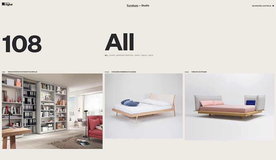
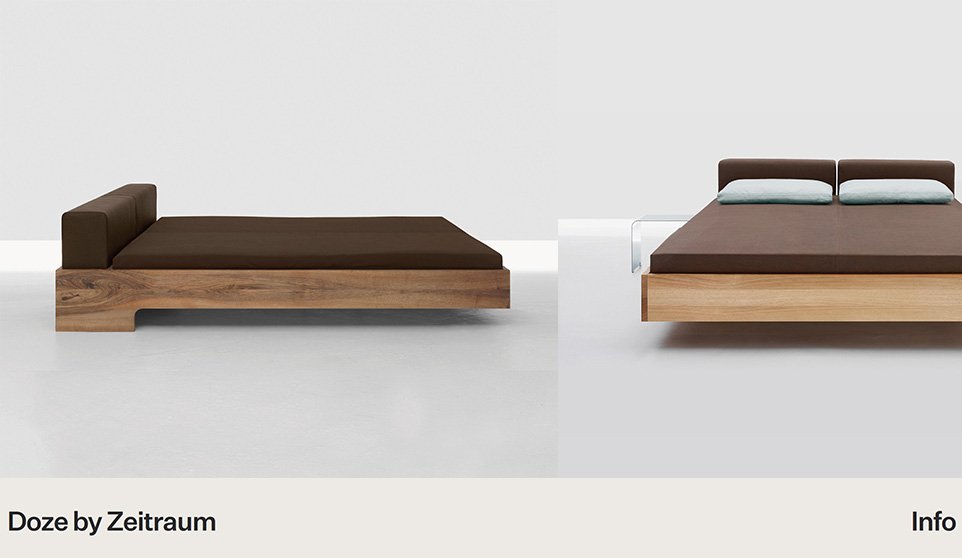
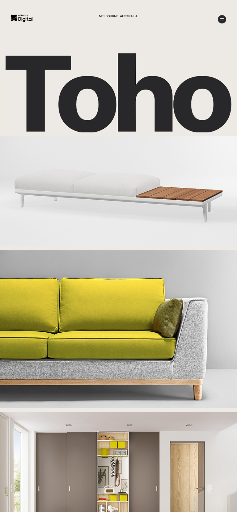
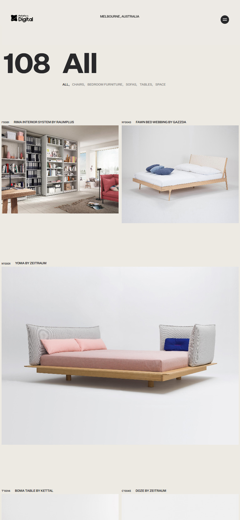
Product Discovery
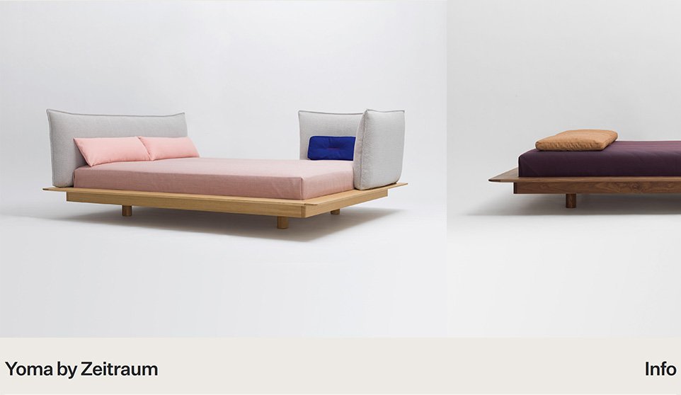
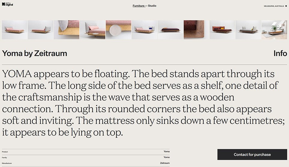
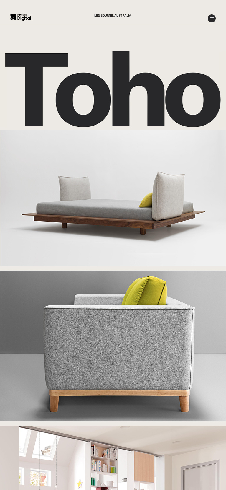
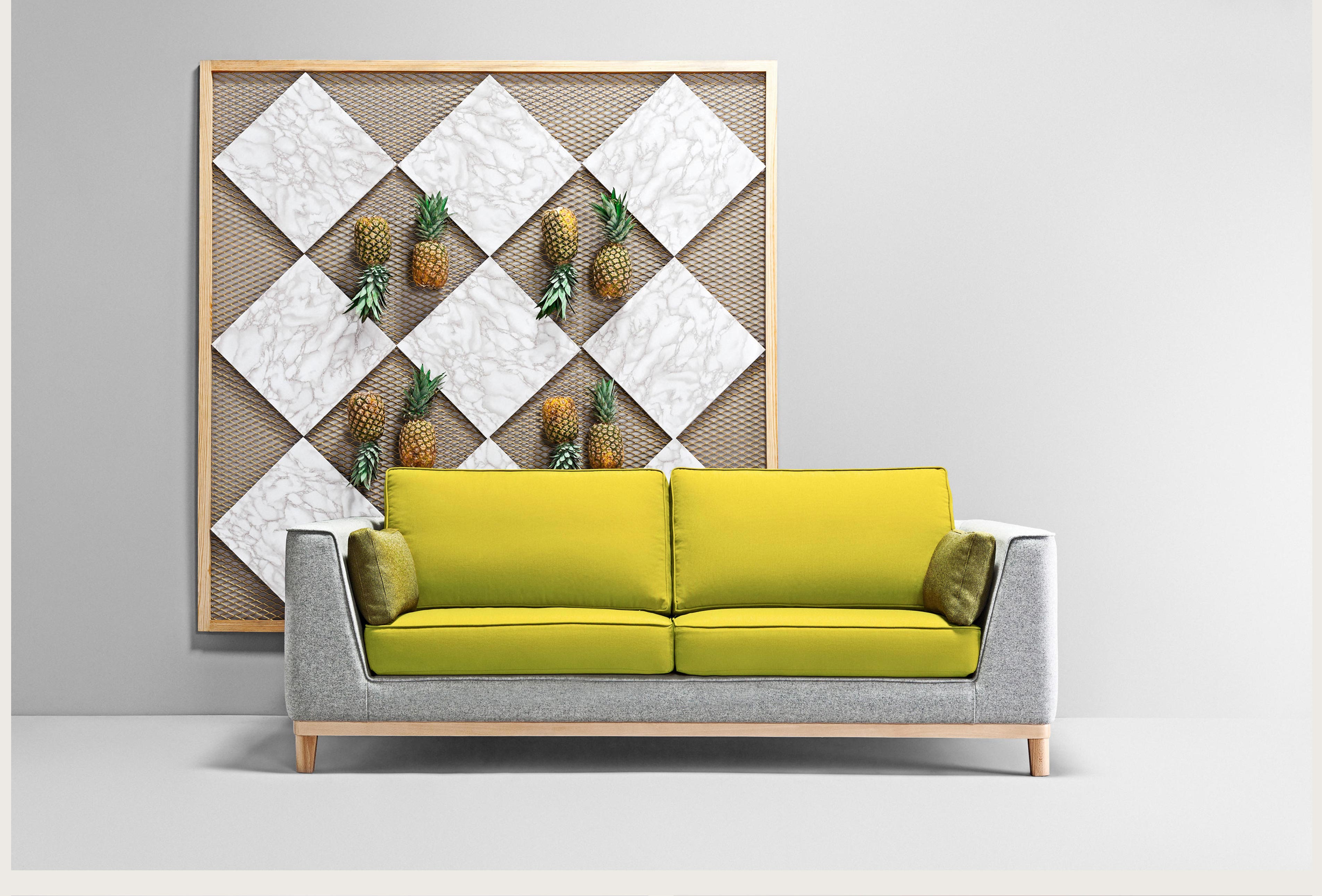
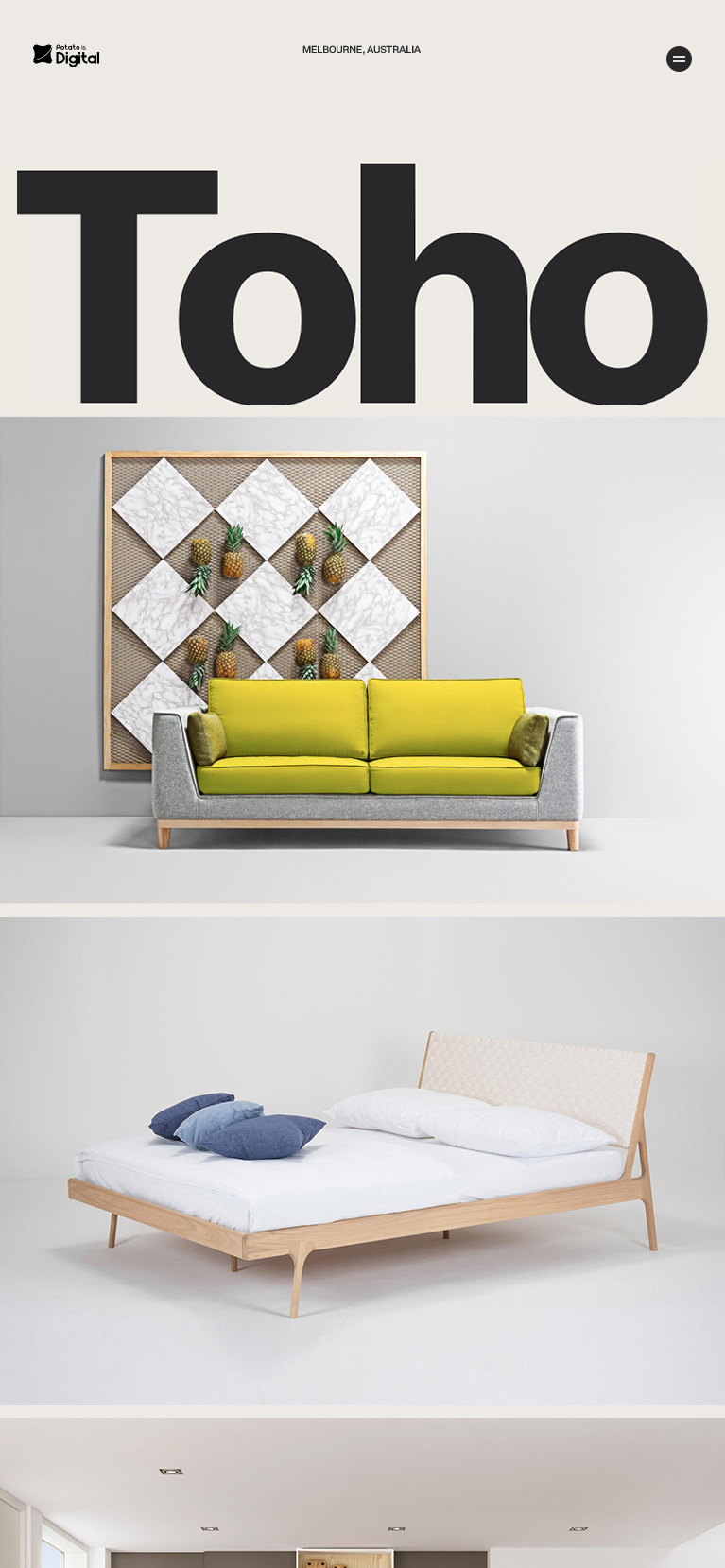
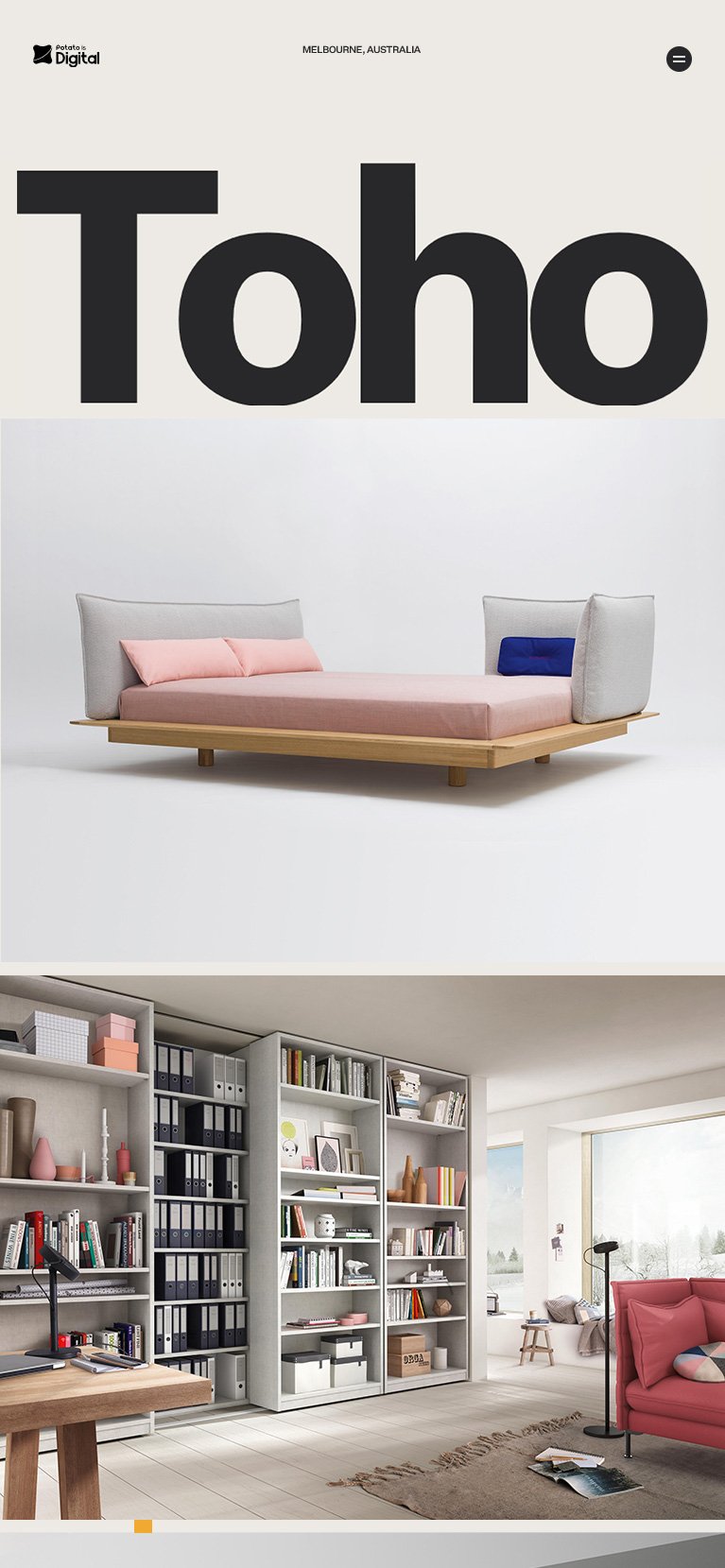
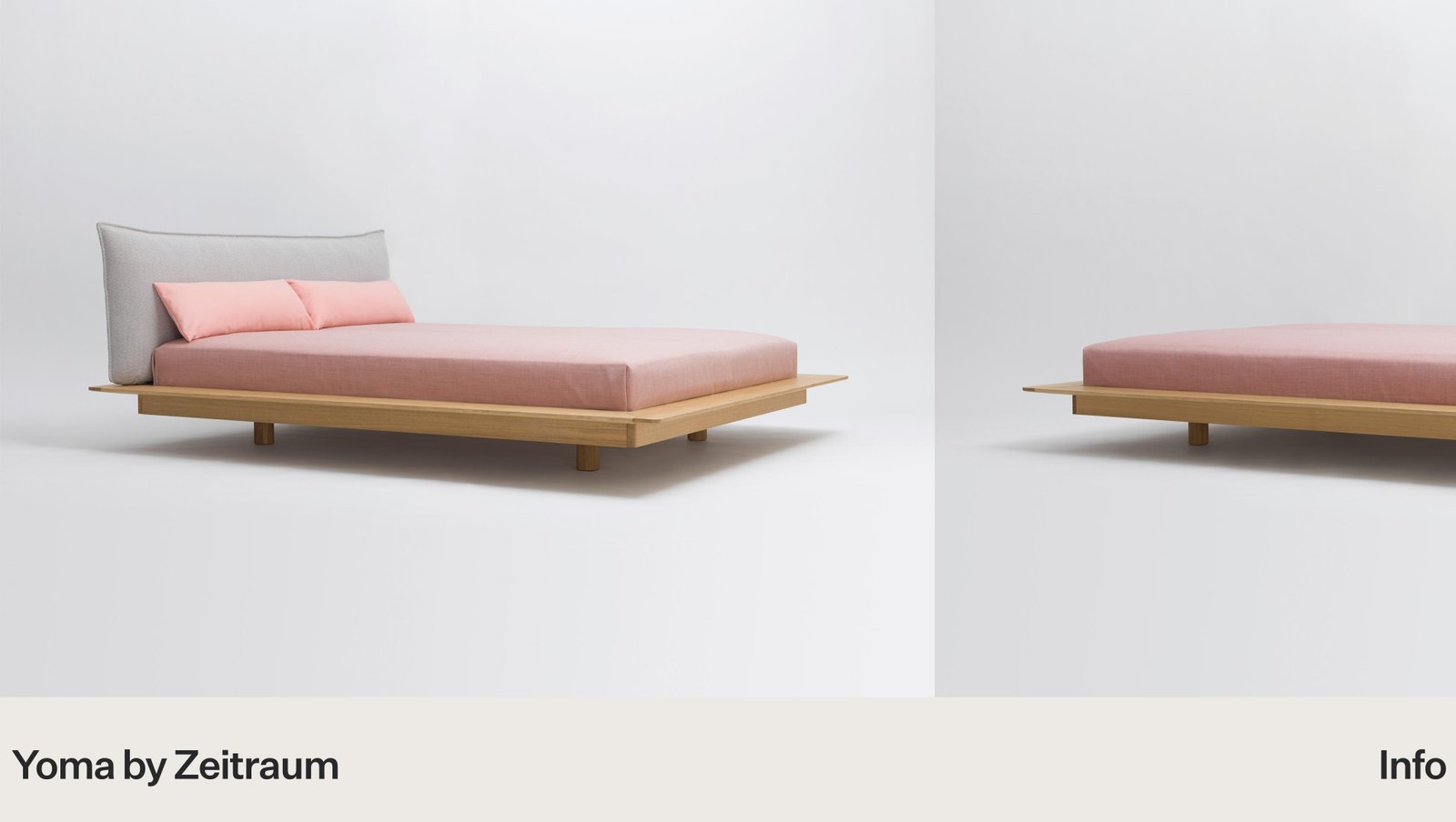
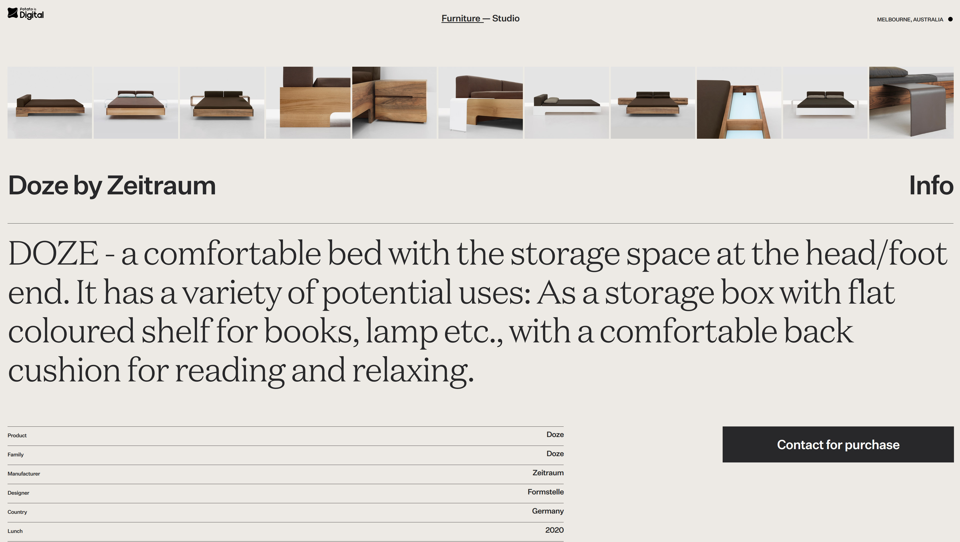
Detail and emotion inform purchase decisions, Toho product presentation connect with its audience meaningfully and tell rich product stories. For site art direction, we introduced warm colour tones to bring out the visual personality of the site, modern CSS image effects, and chose big bold typography for full impactfulness. Visually interactive product layout uniting engagement and product exploration to increase conversion and brand loyalty.
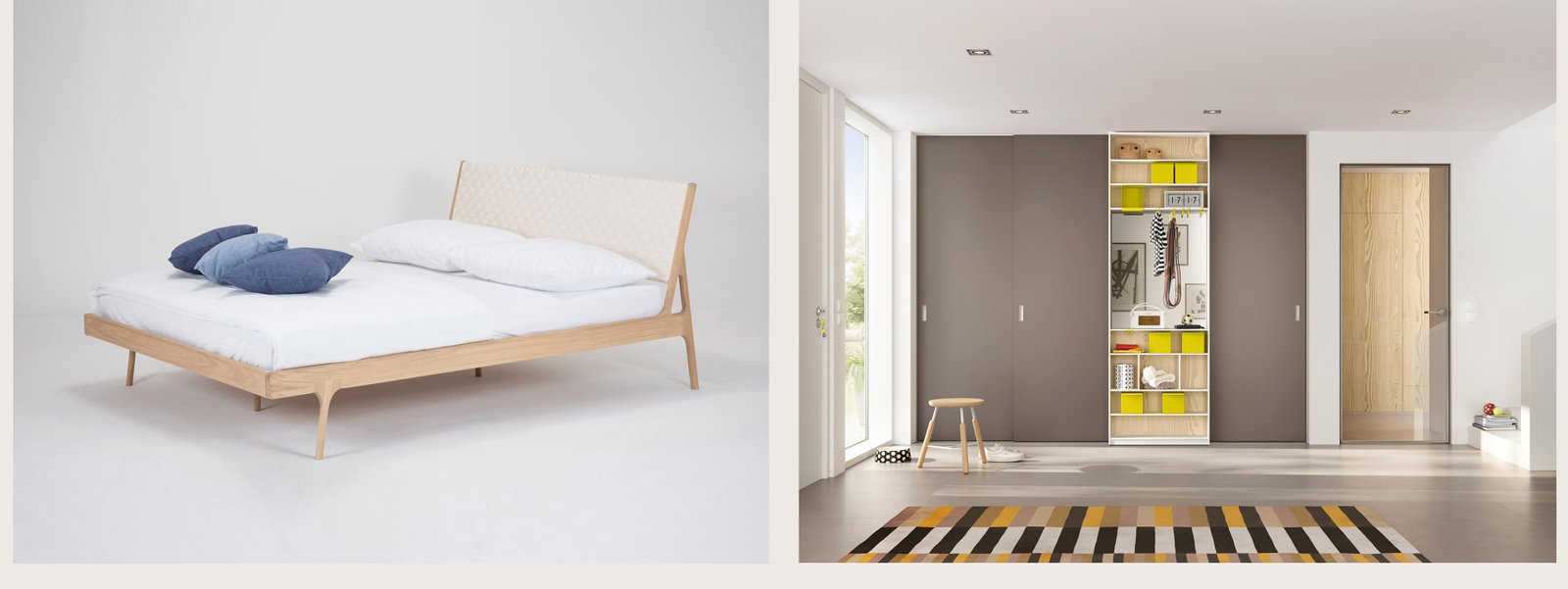
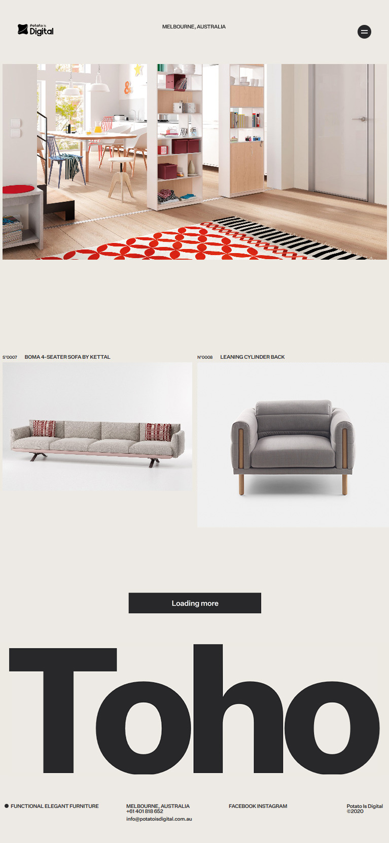
Dynamic Journey
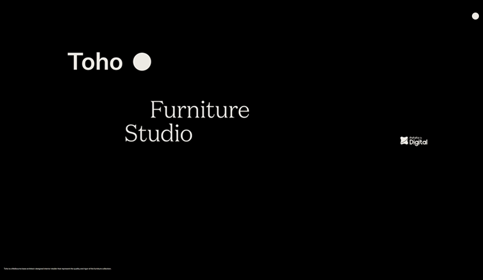
We wanted user to experience something emotionally strong and engaging on their first journey with the brand. We imagine a visitor journey which was inviting, self-explanatory, and powerful dynamic contents homepage to further improve the user experience.
Creating connections through content and architecture
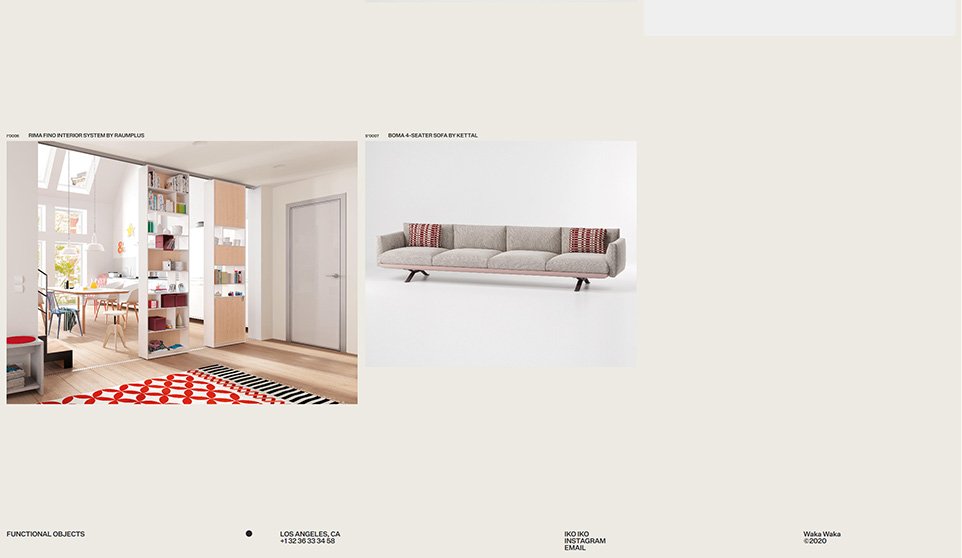
Customisable Modules
The grid and scale of elements are highly-customisable that offers a variety of layout formats to create unique content and product offerings.
To further improve user browsing experience we integrate dynamic content strategy option which help encourage user to explore and discover content.
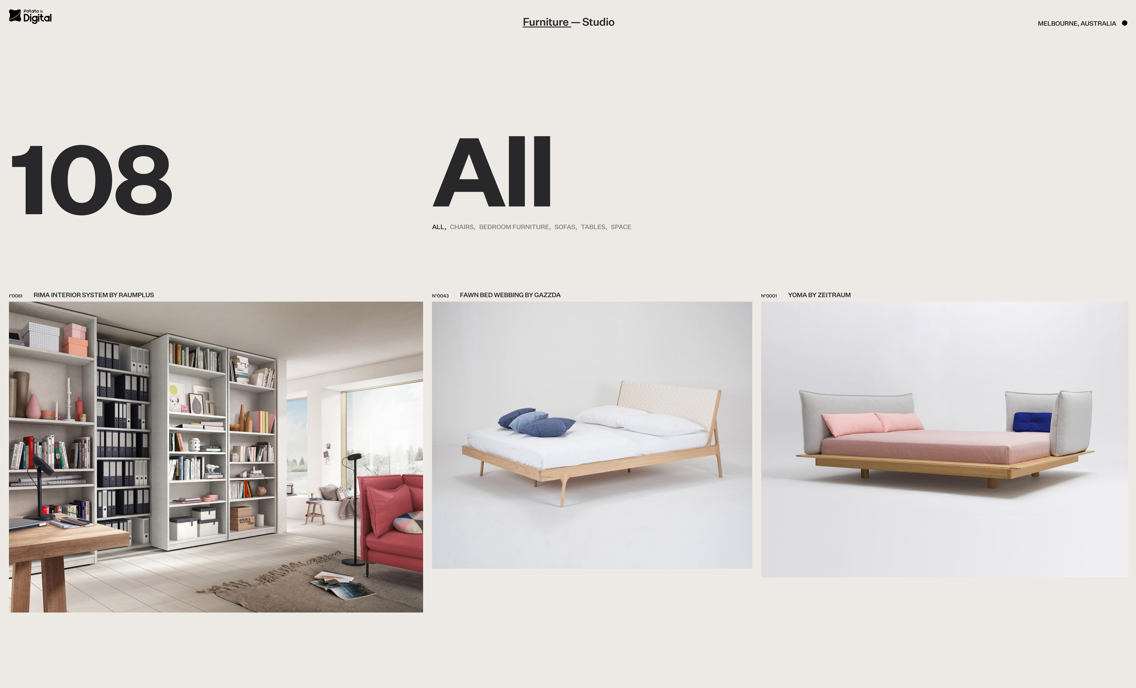

A Universe of Expression
Toho provide brand with an adaptable design solution that can respond fluidly to the ever-changing landscape of media screen.

Visual language that differentiate the brand from the competition
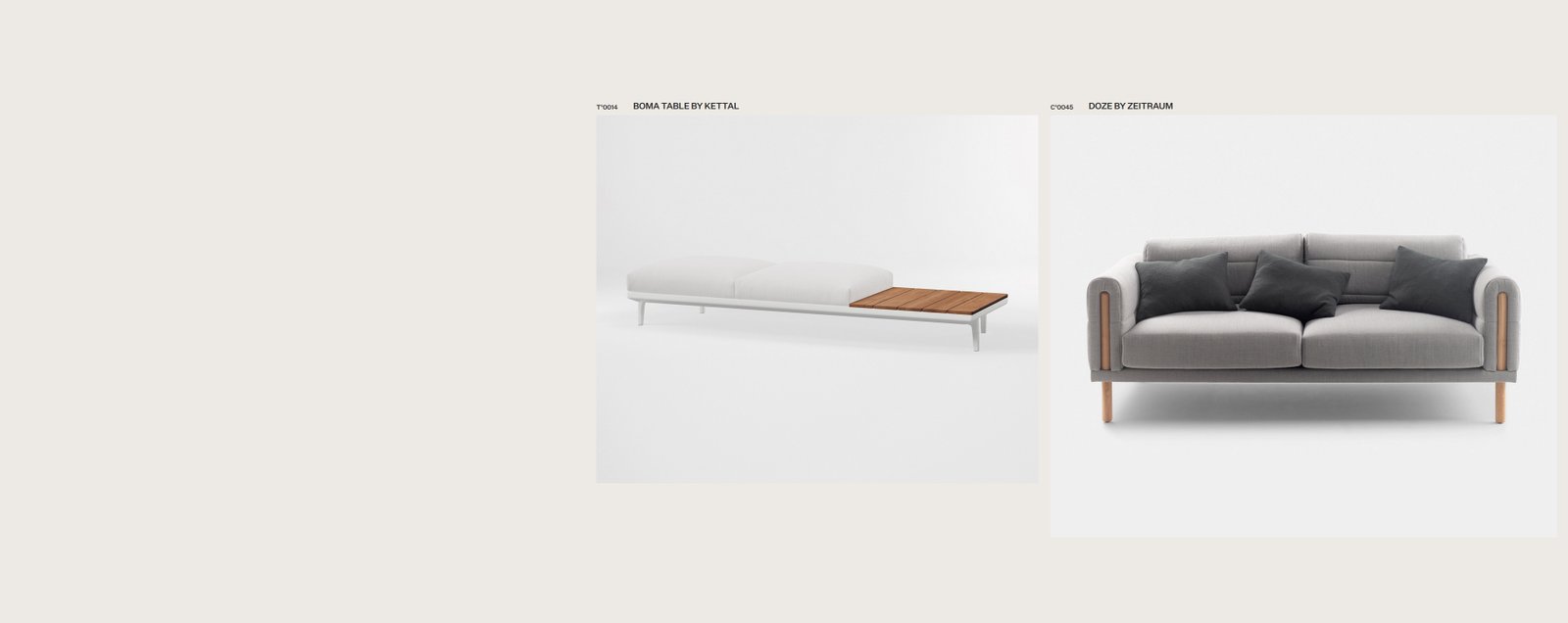
Visual Storytelling
To connect with user on a visual storytelling site requires careful art direction and the adaptive of imagery to create a coherent, resonant brand story that could drive engagement. Establishing this fundamental foundation empowers better storytelling and audience connection.

Responsive Content and Functionality
To further improve the overall user experience on mobile device, we implemented swipe gestures, to improve product user interface. The design adapts through a responsive layout that automatically restructures both content and functionality.
Mobile Swipe Gestures
We streamlined mobile browsing experience by bring swipe gestures to product images, improving accessibility and enhancing the mobile experience.
Keeping it simple and intuitive
Consistent Design
Toho interface design is kept simple and intuitive. The user experience and user interface are consistent in every part of the design, this help improve customer journey, elevate brand experience for Toho that reflects the quality of its products.
A Mobile Site Experience
We adapted the responsive functionality to simplified content and made navigating between pages and sections much easier on mobile and tablet devices.
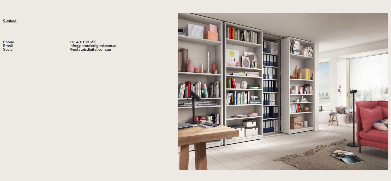
Get In Touch
Interested in learning more about Toho or any other projects? Reach out to tommy@potatoisdigital.com.au.